Want to add a popup to your Divi-powered WordPress site? This post will show you how. Whether you use Divi 4 or Divi 5.
Popup itself is a great email marketing tool if you implement it properly. By meaning that it doesn’t interrupt user experience (UX).
Some internet users really hate popup so you need to be very careful implementing a popup on your website.
Shortcuts ⤵️
Creating a Popup in Divi 4 (Manual Method)
Divi 4 has no built-in feature to create a popup. But you can still create a popup manually (without installing an extra plugin).
The idea of creating a popup in Divi 4 is that you add a section on your page in which the section is dedicated for the popup.
The section will be hidden — using a CSS snippet — on the front-end when you preview or publish your page, but it is still visible on the Divi Builder editor.
To display the section, you need to use a JavaScript snippet, which I will provide later.
In this context, the section functions as the wrapper of the popup.
Here are the steps to create a popup in Divi 4.
— Step 1: Design the Popup Using Divi Builder
First, edit a page where you want to add the popup on. Or you can also create a new page in case you haven’t had one.
Add a new section on the very bottom of your page. You can actually add the section anywhere within your page, but I suggest you add it on the bottom so that it doesn’t interrupt your design process.

Select a column and add any module you want. Here is an example of the modules in my section.

Pro tip: You can rename the section to something like “popup” to make it easy for you to identify it on the future update.
You can play around with the Divi Builder editor to add any module you want to your popup. Once done, go to the Advanced tab and open the CSS ID & Classes settings block.
Add the CSS ID popup-section to the CSS ID field and CSS class wpb-popup-content to the CSS Class field.

# Designing the Popup Overlay
We will utilize the background of the section as the popup overlay. Before setting the background, you need to set the height of the section to 100vh to make it fit your screen once the popup is displayed.
To do so, open the section settings panel and go to the Design tab. Open the Sizing settings block and type 100vh on the Height option.

Once done setting the height, go to the Content tab and open the Background block. You can use any background type here. Be it solid color, gradient, or even image.

If you want your popup to have no overlay, you can simply use a transparent color background.
# Designing the Close Button
You need to provide a close button to allow your users to close the popup. Never create a popup without a close button. Otherwise, your visitors will never return to your website.
We will utilize the Icon module to create a close button of the popup. So, add an Icon module to your popup content and select an appropriate icon. Go to the Design tab to set the color and the size of the icon.
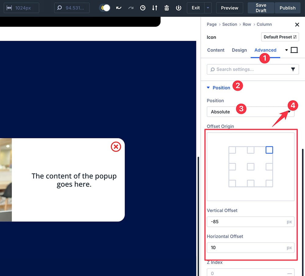
Next, go to the Advanced tab and open the Position block. Set the position to Absolute and select the top-right corner icon on the Location field.
To set a more precise position, you can also set the vertical offset and horizontal offset.
A little tip. To make the close button look good on any device type, you can utilize the responsive editing feature of divi by setting the different values of the vertical offset and horizontal offset.
You can click the phone icon to access the responsive editing feature of Divi.

Lastly, open the CSS ID & Classes block under the Advanced tab and add the wpb-popup-close CSS class to the CSS Class field.

— Step 2: Add CSS Snippet to Hide the Popup
Once you are done designing the popup, the next step is to add the CSS snippet to hide the popup when the page is loaded. Here is the CSS snippet you can use:
/* Show/hide the popup overlay wrapper when "is-visible" class changes, apply the CSS to frontend only */

body:not(.et-fb) .wpb-popup-wrapper {
  position:fixed;
  z-index:990;
  top:0;
  right:0;
  bottom:0;
  left:0;
  transition: all .5s cubic-bezier(.14,.06,.41,1.39);
  opacity:0;
  visibility:hidden;
}
body:not(.et-fb) .wpb-popup-wrapper.popup-is-visible {
  opacity:1;
  visibility:visible;
}

/* Allow the content inside the popup wrapper to scroll */

.wpb-popup-inside {
  height:100%;
  overflow-y: scroll;
}

/* Prevent Body from Scrolling when Popup is visible */

body.wpb-noscroll {
  overflow: hidden;
}

/* Center Align Popup Content inside the Section */

.wpb-popup-content {
  display:flex;
  flex-direction:column;
  justify-content: center;
}
.wpb-popup-content .et_pb_row {
  margin-top:0;
  margin-bottom:0;
}

/* Adjust the position of the popup overlay for admin bar */

@media (min-width:600px) and (max-width:782px) {
  body:not(.et-fb).admin-bar .wpb-popup-wrapper {
    top:46px;
  }
}
@media (min-width:783px) {
  body:not(.et-fb).admin-bar .wpb-popup-wrapper {
    top:32px;
  }
}

/* Mave the popup on top of other elements */

.et_builder_inner_content.popup-is-visible {
  z-index:99999;
}

/* Add a hand cursor to the close trigger element */

.wpb-popup-close {
  cursor:pointer;
}
Not only does the above snippet hide the popup on initial page load, but it also prevents the body from scrolling when the popup is being displayed, place the popup to the center, and add a hand cursor to the close icon.
You can read the comments on each code block to learn more about the code.
# Where to Add the Code?
You can add the above CSS snippet to the Custom CSS field on Divi Theme Options. To do so, go to Divi -> Theme Options on your WordPress dashboard. Under the General tab, scroll down to the Custom CSS option and paste the code here.
Don’t forget to click the Save Changes button.

— Step 3: Add JavaScript Snippet to Handle the Popup Actions
You need to add JavaScript to open and close the popup. Here is the JavaScript snippet you can use for such purposes.
<script>
jQuery(document).ready(function($) {
  $('.wpb-popup-content').each(function(){
    $(this).wrap('<div class="wpb-popup-wrapper"><div class="wpb-popup-inside">');
  });
  $('.wpb-popup-trigger, .wpb-popup-menu > a').off().click(function(e){
    e.preventDefault();
    SectionID = $(this).attr('href');
    $(SectionID).closest('.wpb-popup-wrapper').addClass('popup-is-visible');
    $(SectionID).closest('.et_builder_inner_content').addClass('popup-is-visible');
    $('body').addClass('wpb-noscroll');
  });
  $('.wpb-popup-close').click(function(e){
    e.preventDefault();
    $('.popup-is-visible').removeClass('popup-is-visible');
    $('body').removeClass('wpb-noscroll');
    var PopupVideoIframe = $(this).closest('.wpb-popup-content').find('.et_pb_video_box iframe');
    var PopupVideoSrc = PopupVideoIframe.attr("src");
    PopupVideoIframe.attr("src", PopupVideoSrc);
    var PopupVideoHTML = $(this).closest('.wpb-popup-content').find('.et_pb_video_box video');
    PopupVideoHTML.trigger('pause');
  });
});
</script>
# Where to Add the Code
You can add the above JavaScript snippet on the Integration tab on Divi Theme Options. On the Divi Theme Options screen, go to the Integration tab and paste the code to the Add code to the < body > (good for tracking codes such as google analytics) field.
Don’t forget to click the Save Changes button.

— Step 4: Call to the Popup
Until here, your popup is ready to use. But it won’t show up until you call it. In this post, I will show you to call the popup using two methods:
- Button click
- Page load
# Button Click
To call the popup using button click, you can use the Button module of Divi. If your page hasn’t had one, simply add a new Button module. Once the button is in place, go to the Advanced tab on the settings panel.
Open the CSS ID & CSS Classes block and add the CSS class wpb-popup-trigger to the CSS Class field.

Next, go to the Content tab and paste the text #popup-section to the Button Link URL field on the Link block.

Update or publish your page.
If everything goes well, you should see your popup show up when you click the button.

# Page Load
In addition to button click, you can also display the popup section when the page is loaded. For this method, you can use the following JavaScript snippet:
<script>
  setTimeout(function(){
  SectionID = $('#popup-section');
  SectionID.closest('.wpb-popup-wrapper').addClass('popup-is-visible');
  SectionID.closest('.et_builder_inner_content').addClass('popup-is-visible');
  $('body').addClass('wpb-noscroll');
  }, 5000);
</script>
You can place the above snippet to the same location as the previous JavaScript snippet (under the Integration tab). Simply paste it right after the last line of the previous JavaScript snippet.

On the above code, the popup will be displayed once the page is loaded, with a 5-second delay. You can increase or decrease the delay duration by changing the value of 5000 to any value you want.
Just keep in mind that the value is in a millisecond unit.
Creating a Popup in Divi 5
Divi 5 brings in a bunch of new features. One of which is Interactions. It is not a feature designed specifically to create a popup. Rather, it is designed to be a versatile feature to add interactive elements to your page.
Popup is one of the interactive elements you can create with the feature.
The idea of creating a popup in Divi 5 is the same as Divi 4 where you can add a section dedicated for the popup content.
Follow the steps below to learn how to create a popup in Divi 5 using the Interactions feature.
🚨 Make sure you have upgraded to Divi 5 before following the steps below. You can upgrade to Divi 5 without extra fee.
Download Divi 5
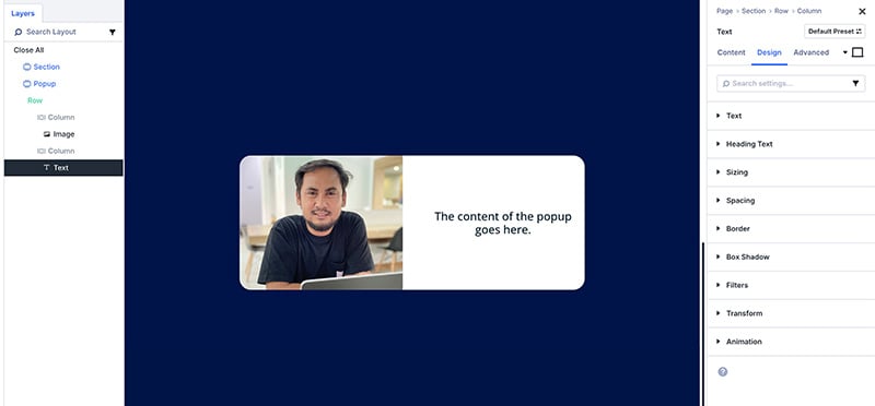
— Step 1: Design the Popup
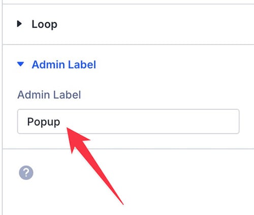
First, add a new section on the page you are designing. To make it easy for you to find it later, you can add a label to the section. Something like “Popup“.
Before you add the content to your popup, you can set the size and the position of the popup. Fyi, Divi 5 supports flexbox layout to allow you to set the alignment of your content more easily.
Same as Divi 4, you can also use the background of the section as the overlay of the popup.
Once you are done setting the size and alignment of the popup, you can start to the content (modules).
You can add any content you want using the native Divi modules or modules from the third-party plugins.
Also, you can apply any design style per your liking. Once you are done with the popup design, you can move on to the next step below.
— Step 2: Add the Close Button
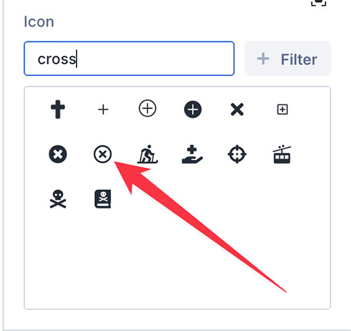
To make your popup closable, you need to provide a close button. Ideally, you use the Icon module for the close button, but you can also use other modules (e.g. the Button module).
In this post, I will use the Icon module for the close button.
Simply click the black plus icon on the Divi Builder editor and add a new module. Select an icon that best represents the close button (e.g. the cross icon).
Go to the Design tab on the settings panel to style up the button. From this tab, you can set things like icon color and size.
Next, you can go to the Advanced tab and open the Position settings block. Set the position to Absolute and set the vertical and horizontal until you get a suited position for the close button (the Icon module).
Once you are satisfied with the design and the position of the close button, you can open the Interaction settings block under the Advanced tab.
Click the plus icon to add an interaction. On the appearing window, give your interaction a label on the Admin Label field.
Set the trigger event to Click and effect action to Hide Element. On the Target Module part, you can select the section you want to be the popup. Click the Save button to apply the settings.
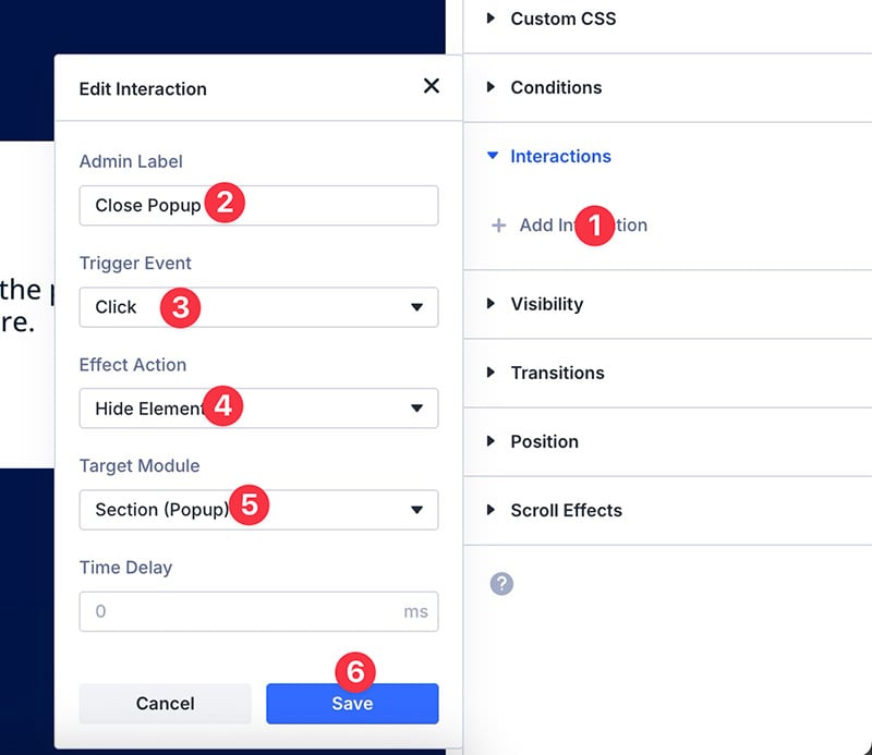
You don’t need to set the time delay because you, ideally, want the popup to close immediately after the close button is clicked.
— Step 3: Set a Trigger of the Popup
Your popup is ready. But it will act as a regular section until you add the extra settings below.
First, you need the section to be hidden on the initial page load. Second, you need the section to be displayed after a certain duration.
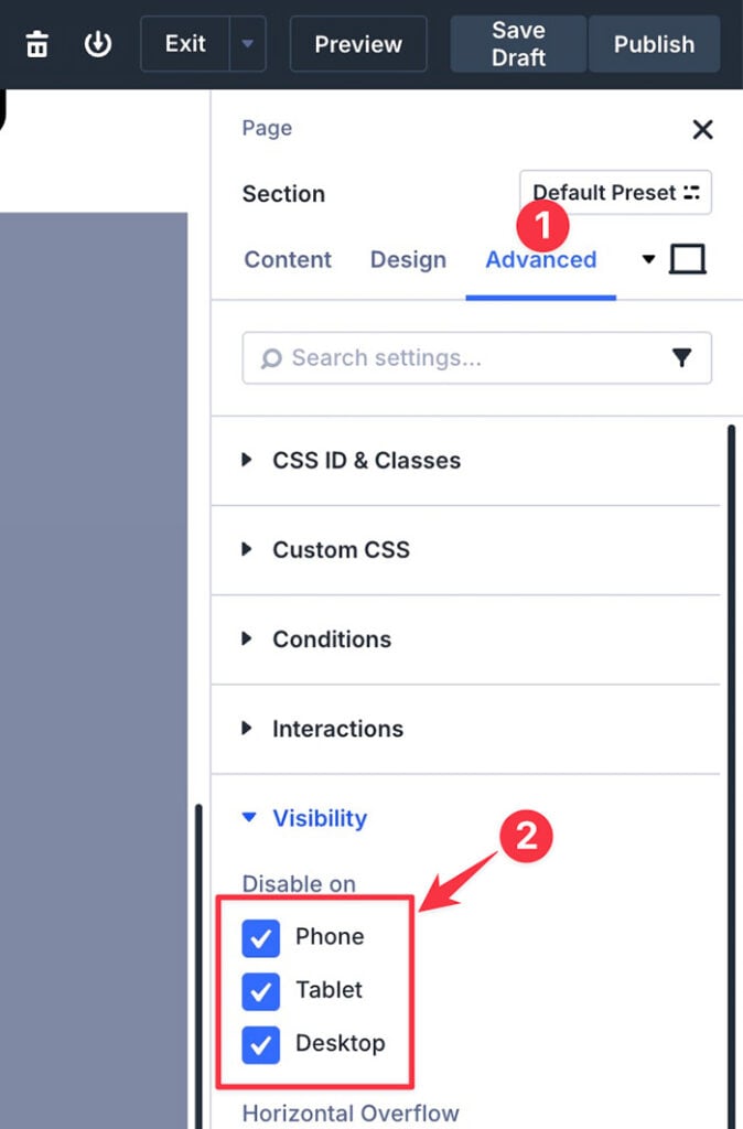
To hide the section on the initial page load, first, select the section to open the settings panel, then go to the Interactions block under the Visibility tab.
Check all the options to hide the section on all devices on initial page load.
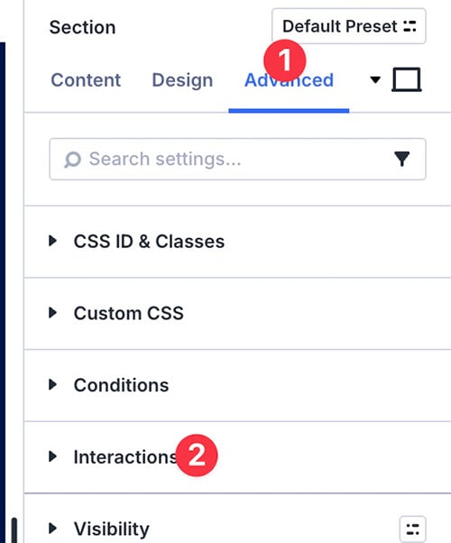
To show the section (aka the popup) after a certain period, open the Interactions block and click the plus icon to add an interaction and select Load.
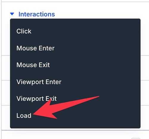
🚨 If you want your popup to have a different behavior (e.g. opens on click), you can simply select the appropriate option.
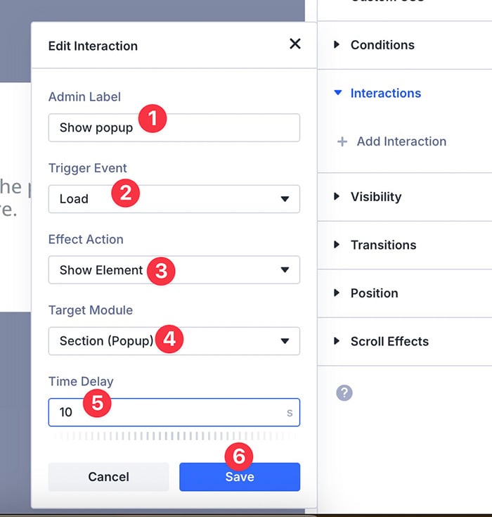
On the appearing window, give the interaction a label. On the Trigger Event part, set to Load. On the Effect Action part, set it to Show Element.
Select the section of the popup on the Target Module and set the time delay to make it show up after initial page load. Click the Save button to apply the settings.
— Step 4: Adjust the Position of the Popup
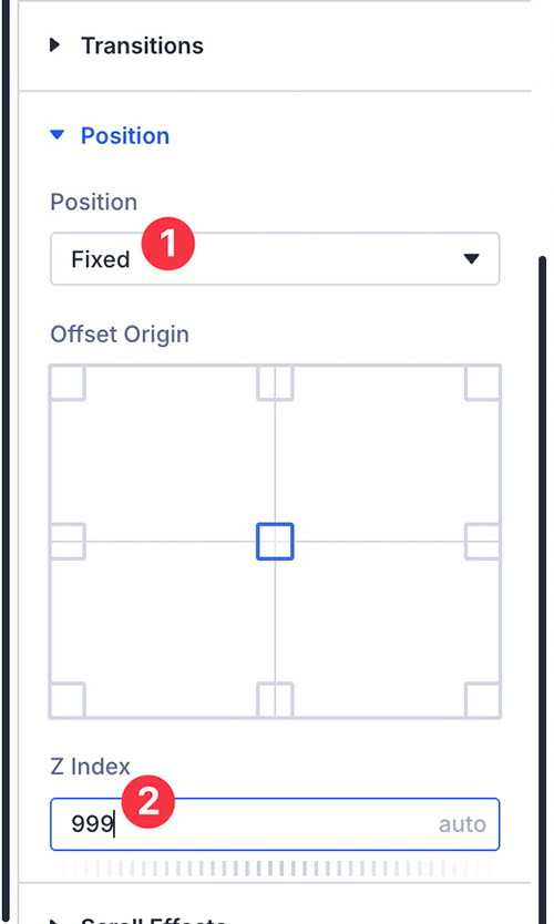
After following all the steps above, your popup will show up after a certain duration according to your setting. But, it will show up according to stack order.
For instance, if you place the section of the popup at the bottom of the stack, it will be shown at the bottom of the stack too.
To make it act as a popup, you need to set its position to Fixed. You also need to set the Z index to 999. This will make the section to always be in front of other elements on the page.
To set these settings, you can open the Position block under the Advanced tab.
Example of Popup Created with Divi 5
Here is an example of a simple popup creating with the new Interactions feature of Divi 5.

Summary
Divi 4 has no built-in feature like, for instance, Elementor Pro. To create a popup in Divi 4, you need to install an extra plugin. Or you can also use the manual method as I have elaborated above.
In Divi 5, creating a popup has become a lot easier thanks to the Interactions feature. The feature is designed to allow you to add interactive elements to your page. Including a popup.
Although creating a popup using the Interactions feature may interrupt your design experience, at least you no longer need to install an extra plugin to create a popup in Divi.